
The challenge
Hype+ wanted a premium direction in a category often defined by loud graphics. The identity needed enough restraint to feel deliberate while still working across two adjacent product lines and their digital presence.
A restrained identity for energy and nicotine pouches, carried through packaging, stationery and a custom WordPress website.
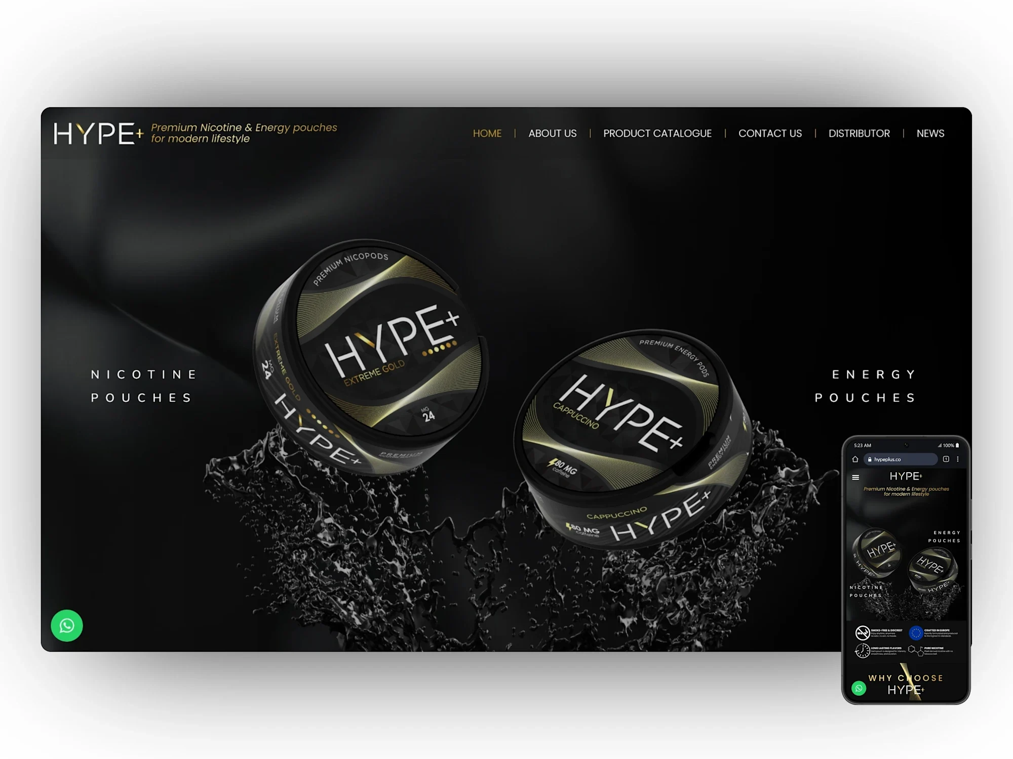
Hype+ wanted a premium direction in a category often defined by loud graphics. The identity needed enough restraint to feel deliberate while still working across two adjacent product lines and their digital presence.
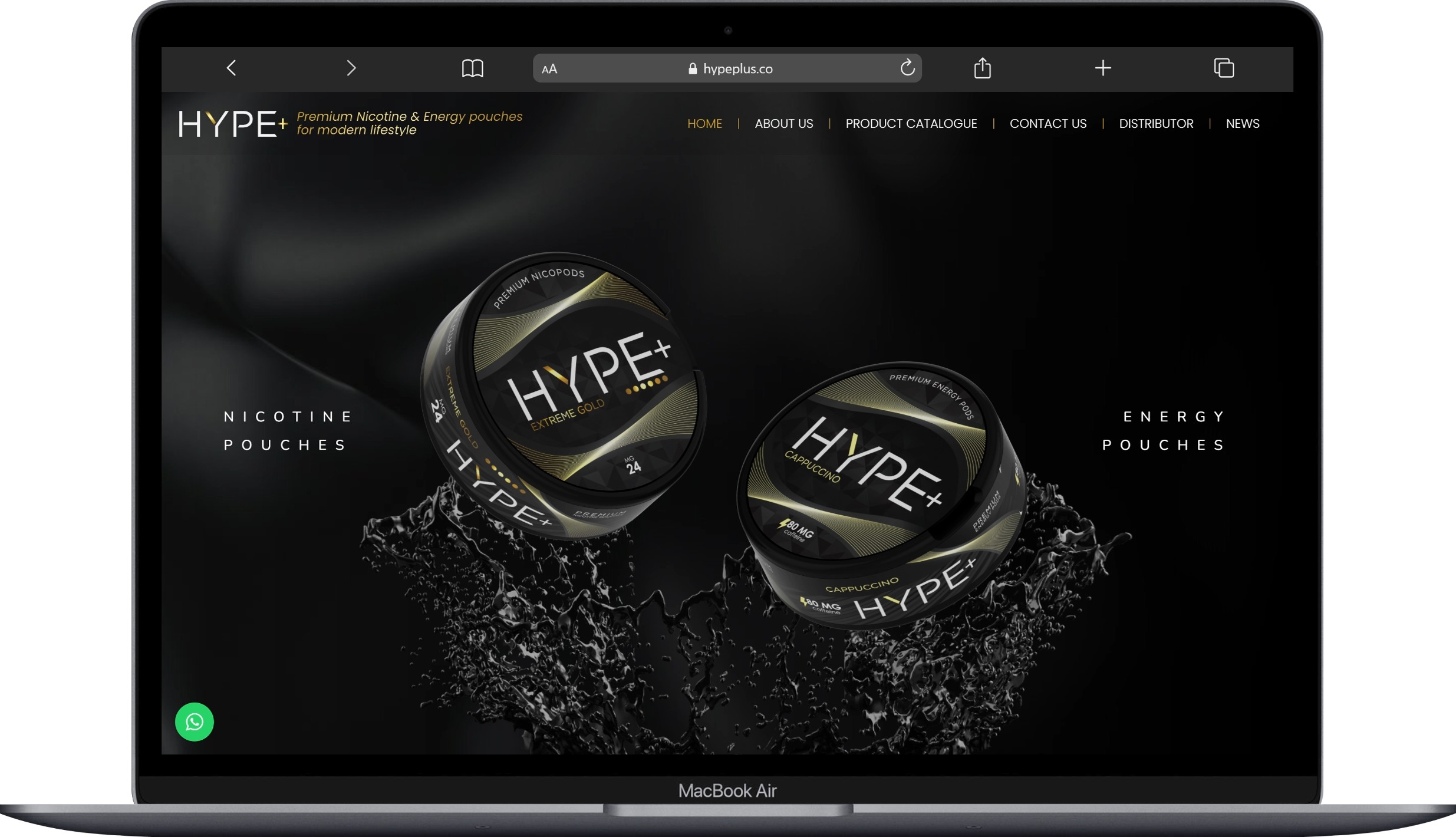
I developed a dark, minimal visual language and applied it to the logo, packaging and company stationery. 3D mockups tested finish, embossing and label placement. The WordPress website carries the same palette and typography into an online experience.
The initial brand build became an ongoing relationship covering new SKUs, packaging updates and website maintenance. Physical and digital touchpoints retain the same clear visual character.
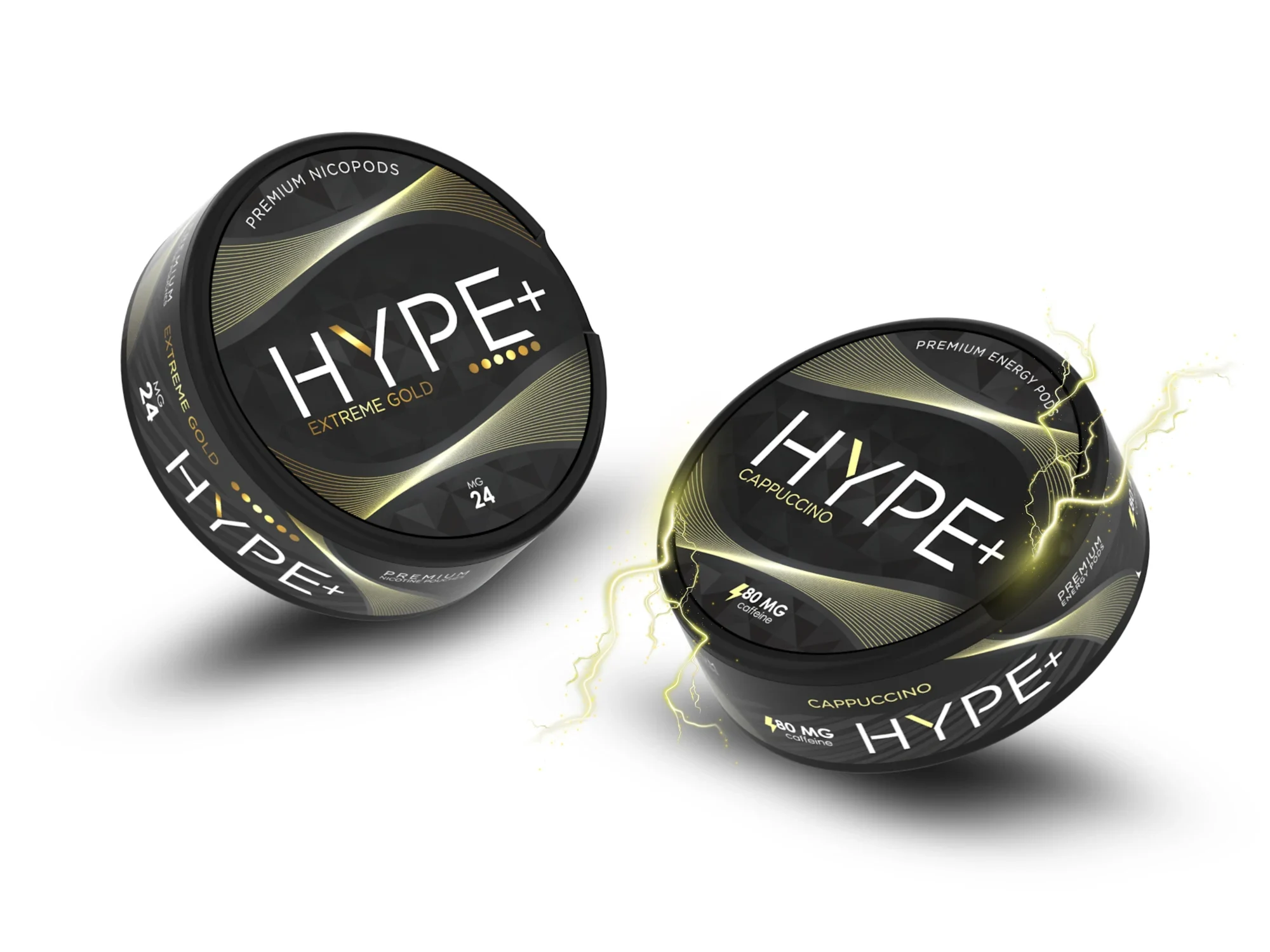

A distinctive stag wordmark and high-contrast pouch packaging, evaluated through realistic 3D tin mockups.

A complete pouch-brand launch system, from logo and flavor packaging to 3D renders, a WordPress store and a wholesale catalogue.