
The challenge
TREND wanted a bold shelf presence, a different direction from the restraint used for Hype+. The identity needed an unmistakable symbol and packaging that held its contrast on a reflective curved surface.
A distinctive stag wordmark and high-contrast pouch packaging, evaluated through realistic 3D tin mockups.
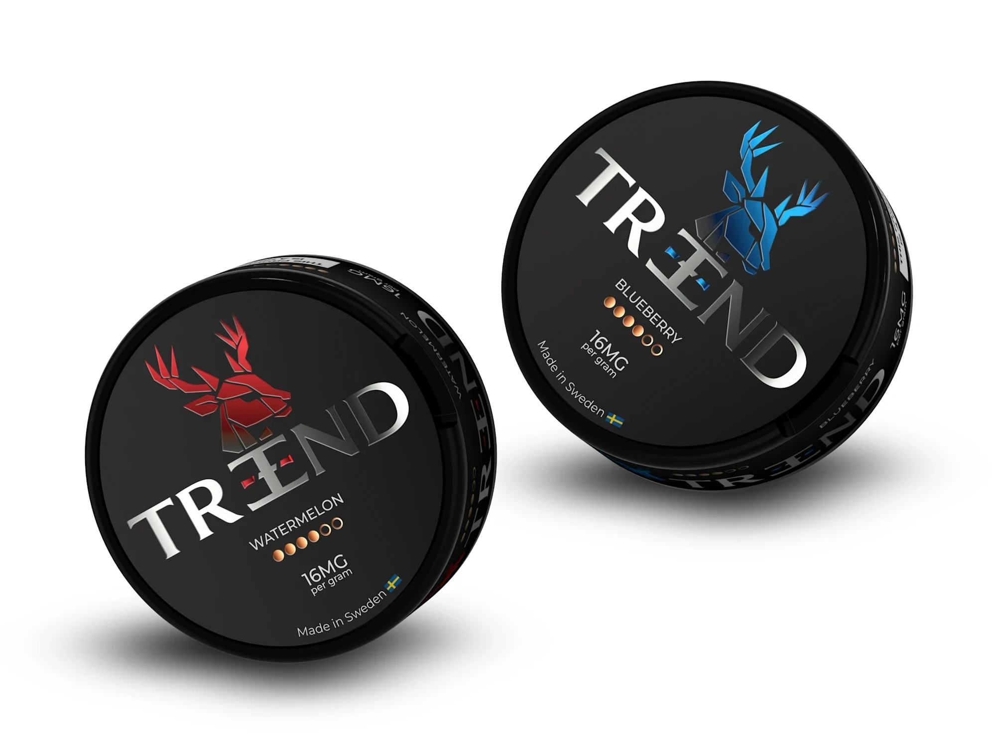
TREND wanted a bold shelf presence, a different direction from the restraint used for Hype+. The identity needed an unmistakable symbol and packaging that held its contrast on a reflective curved surface.
I integrated a stag motif into the wordmark rather than separating it into a secondary icon. Strong color relationships and confident typography carry that identity into the packaging, while 3D mockups test the design under lighting and on the actual tin shape.
The final identity and packaging form a connected product presentation. The project shows how the same identity-first process can produce a sharply different visual character for a different brand brief.

A restrained identity for energy and nicotine pouches, carried through packaging, stationery and a custom WordPress website.

A complete pouch-brand launch system, from logo and flavor packaging to 3D renders, a WordPress store and a wholesale catalogue.