
The design focus
A pouch-tin packaging study built around a dark blue and gold direction. The circular format requires the identity and product information to hold their hierarchy within a small, curved application.
A dark blue and gold pouch-tin design, using ornamental graphics and clear brand lettering within a compact circular label format.
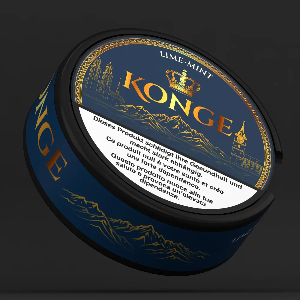
A pouch-tin packaging study built around a dark blue and gold direction. The circular format requires the identity and product information to hold their hierarchy within a small, curved application.
The artwork combines prominent Konge lettering, ornamental details and a controlled color palette. The product mockup shows the lid and side treatment together, highlighting the relationship between the branded front and supporting information.
The archive image presents the packaging in three dimensions so the finish, curvature and label placement can be viewed as one object. The view brings the lid graphics, side labeling and tin finish into a complete product presentation.

A natural pet-care identity developed through four packaging directions, final production artwork and realistic product renders.

An e-liquid concept developed into a complete identity, print-ready packaging, 3D visuals and a Webflow pre-launch page.